With billboards, your copy and text considerations all have to do with speed. Drivers only have a few seconds to interact with your ad, so your message must be incredibly concise and clear. In fact, text and font choices may be more important on billboards than any other type of advertising.
Here are four tips you should follow:
1. Use five to seven words.
You’ll need to hammer down to the heart of your message, but it’s worth it. Studies show that most people stop reading billboard ads at around five words.
2. Choose fonts that pack a punch.
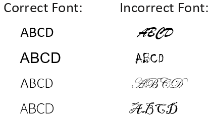
This doesn’t mean cutesy and clever fonts. Rather it’s best to choose a font that is weighty and easy to read. Cursive scripts and narrow lettering are the hardest fonts to read on a billboard and should be avoided. See examples below.
3. Create high contrast.
You can’t read what you can’t see, especially when you’re traveling down a highway. Crisp color contrast will make your text pop.
4. Skip the fine print.
The information will get lost and may even detract from the main purpose of your ad. Save the fine print for your brochures and website.